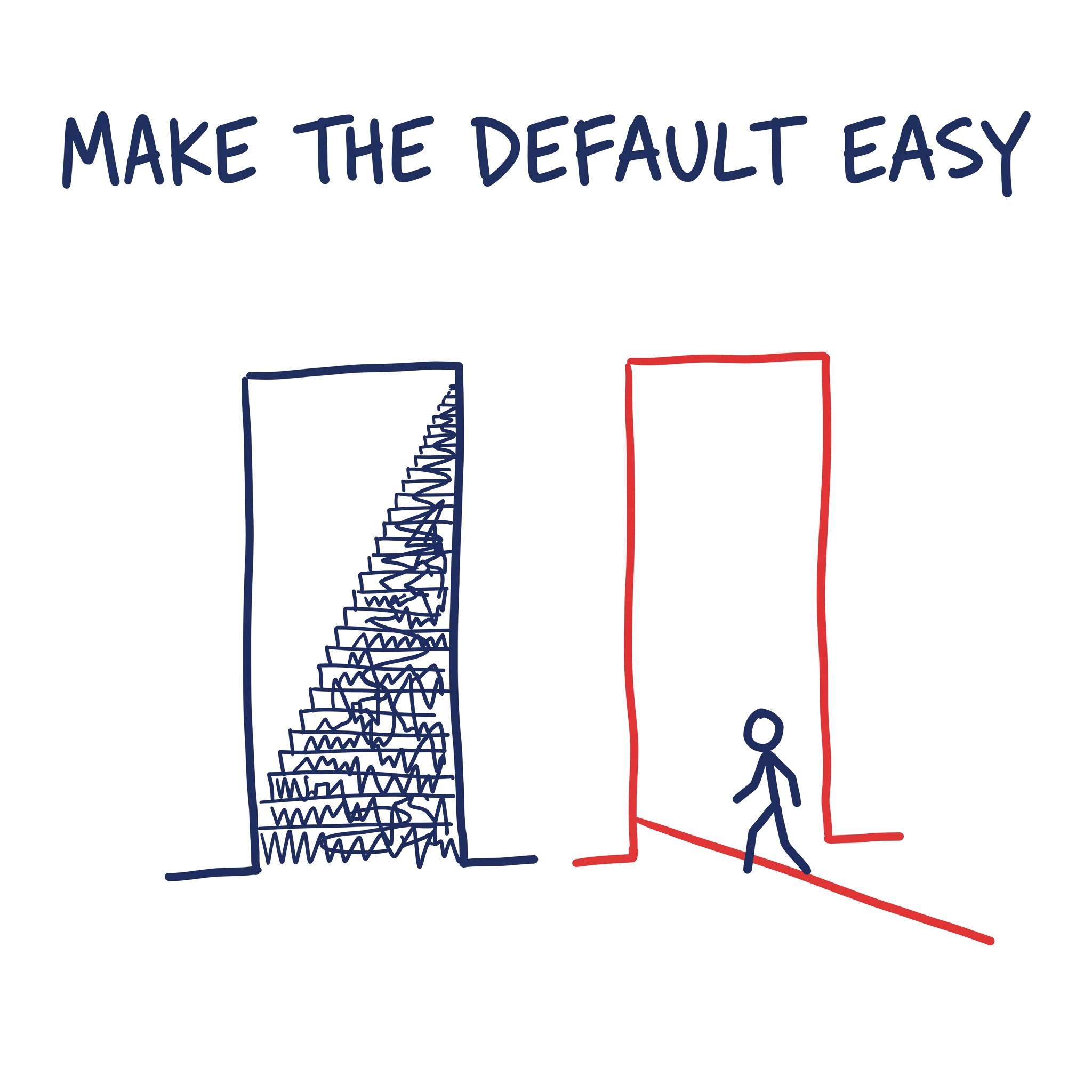
Put a plate of biscuits at reception and they are gone by lunch. Put the same plate in a cupboard across the office and it lasts the week. People did not choose to eat fewer biscuits, they just would not walk across the office for one. Change what sits in front of people and their behaviour changes with it.
Nudge, from my bookshelf, was a book that inspired me to think about why people behave the way they do: the principles of behavioural science that have been part of my thinking as a marketer and product designer.
In my role I am employed to influence, to change people’s minds. To educate, to persuade, to incentivise. All of what I and other businesses do assumes a rational person who weighs the options and chooses well once they have the facts. In Nudge, Richard Thaler and Cass Sunstein start from the opposite and truer place: people do not optimise, they satisfice. We choose a solution that is “good enough”, or meets the minimum requirements, rather than spending the time and effort to find the absolute best or optimal choice.
None of that is a flaw to be corrected. It is simply how people are, and it is something you can design for. In Nudge it is one of the six main principles or tools of choice architecture used to shape behaviour: ‘defaults’. That is, a pre-selected option that happens automatically if a person does nothing. People heavily stick with defaults due to inertia.
The default nudges you already live inside
You do not have to look far for examples. The companies you use every day are built on it.
Netflix never asks whether you want the next episode; it plays it. Making “keep watching” the default, rather than a decision at the end of every episode, is a big part of why we binge, and why Netflix measures itself in hours watched.
Amazon’s one-click ordering did the same thing to friction. Strip checkout down to a single tap, make your saved details the default, and you remove every small moment where a buyer might reconsider. It was valuable enough that Amazon patented it and licensed it to Apple.
Spotify’s Discover Weekly hands you a playlist you did not ask for and did not build, refreshed every Monday. A good default, delivered on a rhythm, turned passive listeners into daily ones.
Thaler and Sunstein are full of examples, some very small, but impactful. A school cafeteria: move the fruit to eye level and the chips out of easy reach, and children eat more of the good stuff, without a word of nutrition advice or a single item banned. Amsterdam’s Schiphol airport etched a small fly into the urinals for men to aim at, and the airport credited it with a sharp fall in spillage and cleaning costs. In a well-known study by Johnson and Goldstein, countries that make organ donation the default carry consent rates above ninety percent, while opt-in countries sit far lower. And Thaler’s own Save More Tomorrow is a savings program that lifts people’s savings automatically with every pay rise, which has moved retirement saving further than decades of telling people to try harder.
The hardest number comes from pensions. When one large US employer switched new staff from opting in to being automatically enrolled, with the freedom to opt out at any time, participation in the retirement plan rose from 49% to 86% (Madrian and Shea, 2001). Nobody was paid or persuaded. The only thing that changed was which box was already ticked.
None of these change the person. They change the setting the person is standing in.
There are other forms of nudges
The book identifies other forms of nudges, or choice architecture principles, that are also useful for product designers and marketers alike.
1. Expect error and design for the predictable mistake. The ATM gives your card back before the cash. People used to grab the money and walk off, leaving the card behind, so the machine was re-sequenced to force you to take the card first. Gmail gives a warning: “you wrote ‘attached’ but didn’t attach a file.”
2. Make mappings clear and translate the abstract into the concrete. The “80 km of range left” readout in a car, instead of a fuel needle.
3. Give timely feedback when people are on or off track. The roadside “YOUR SPEED” sign that flashes your number as you drive past: no ticket, no penalty, just instant feedback, and people slow down. It works better than a speed-limit sign alone. Reversing sensors beep faster the closer you get to the bumper.
4. Structure complex choices and turn an overwhelming field into a few clear options. “Good / Better / Best” pricing (broadband, insurance, software), where fifty variables collapse into three columns you can actually compare, is pretty much how every subscription you buy is sold. Netflix’s “Because you watched…” narrows a catalogue of thousands to a handful it thinks are for you.
5. Align incentives and make the consequence visible, relevant and immediate. The energy bill that shows “you used more than similar homes nearby.” Adding one neighbour-comparison line to a boring utility bill can cut household energy use measurably.
6. Add a decoy. A third option almost nobody picks can make the one you want look like the obvious deal. When The Economist offered a web subscription at $59, print at $125, and print-plus-web also at $125, 84% of people chose the bundle, because the pointless print-only option made it look like a steal. Take the decoy away and most people switched to the cheaper web-only. The option nobody wanted lifted revenue by around 43% (Dan Ariely, Predictably Irrational).
If you apply one thing from this
Read the book. And if you are short on time, here are a few things to think about to take advantage of the behavioural-science theory of ‘defaults’:
- Make the behaviour you want the easy choice. Consider the default.
- Frame for the loss, not the gain. People avoid risks at all costs.
- Cut the steps. Every extra field, click or decision is a place people drop out, and removing friction beats adding persuasion almost every time.
- Test the wording, not just the offer. Run two framings and watch how people react, because the gap is usually larger than you expect and rarely the one you predicted.
The fair objection
The real objection is that this type of nudge is a short step from manipulation. The same lever that auto-enrols someone in a pension also auto-enrols them in a subscription they will spend twenty minutes trying to cancel. The web is full of it: the pre-ticked box, the guilt-worded decline, the cancellation flow built like a maze.
The honest test I use is simple. Am I making a design or a campaign that is better for the customer, or one that is just better for me? Used the first way, choice architecture is good design, a good experience, and it compounds trust. Turned the other way, it becomes a dark pattern that borrows against a relationship you are going to need later.
So the lesson I took from Nudge was less a technique than a change in where I look first. When behaviour will not move, I have stopped asking how to make the argument better. I ask what the environment is rewarding instead, and then I change that.